What kinds of things does Bootstrap include in its CSS to help with this? Let’s examine a few things and gain some insight that might help us in our own custom projects.
Defining Proper Media Queries
Bootstrap has clearly defined breakpoints for different kinds of devices, specified by using CSS media queries. The following are the breakpoint categories used for the different types of devices:- Extra Small Devices (e.g. cell phones) are the default, creating the “mobile first” concept in Bootstrap. This covers devices smaller than 768px wide.
- “Small Devices” (e.g. tablets) are targeted with
@media (min-width: 768px) and (max-width: 991px) { ... }. - Medium Sized Devices (e.g. Desktops) have a screen size smaller than 1200px and greater than 991px, using
@media (min-width: 992px) and (max-width: 1199px) { ... }. - Larger Devices (e.g. wide-screen monitors) are greater than 1200px, targeted using
@media (min-width: 1200px) { ... }.
This kind of categorization is common in responsive frameworks and it’s something you can certainly benefit from understanding better.
The Grid System Demystified
If you are familiar with Bootstrap’s grid system, you might know that there is a specific HTML structure required to properly set up its grids. Let’s demystify it.Let’s first have a look at Bootstrap’s HTML for a two-column setup:
1
2
3
4
5
6
7
8
9
10
11
12
13
| <div class="container"> <div class="row"> <div class="col-xs-6"> <p>Column 1</p> </div> <div class="col-xs-6"> <p>Column 2</p> </div> </div></div> |
.container has different widths for different types of devices whereas .container-fluid expands to fit the width of the device.With the help of media queries, Bootstrap gives different widths to the
.container depending on the size of the device:- Extra small devices (<768px):
width: auto(or no width) - Small Devices (≥768px):
width: 750px - Medium Devices (≥992px):
width: 970px - Larger Devices (≥1200px):
width: 1170px
.container class.
1
2
3
4
5
6
| .container { padding-right: 15px; padding-left: 15px; margin-right: auto; margin-left: auto;} |
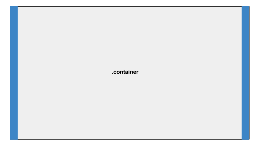
As seen in the above image, the
.container prevents the
content inside the element from touching the browser edge using 15px of
padding on each side. It also ensures the container is centered using auto for left and right margins.Rows are another important element in Bootstrap’s Grid System. Before creating columns, you can define a row using the class
.row. Here’s a snippet from Bootstrap’s CSS for the .row class:
1
2
3
4
| .row { margin-right: -15px; margin-left: -15px;} |
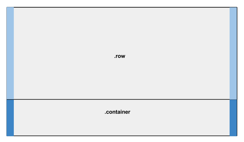
You may have noticed that the margins on the row seem to be counteracting the 15px of padding applied to the container. If we analyze the columns, we can see why this is needed.
Here’s a snippet from Bootstrap’s CSS for the
.col-xs-6 class.
1
2
3
4
| .col-xs-6 { padding-right: 15px; padding-left: 15px;} |
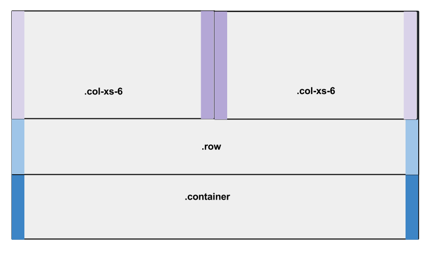
Because of the negative margins on the row, the columns are touching the edges of the row and the edges of the container. But the padding causes the contents that go inside these columns to remain 15px away from the edges of the container.
Containers are used for multiple purposes, not just for the grid system, so the 15px padding helps to avoid the content touching the edges of the browser (when using
.container-fluid). Rows have the negative margins so that they are not pushed by the padding of the container. If you are considering designing your own framework, you might want to consider using this padding/margin technique.
Defining Proper Column Widths
Bootstrap uses percentages (%) as the unit to define the widths of columns, helping with responsiveness. As stated above, there are 4 different categories of device-based breakpoints. Each category has its own set classes for columns of different sizes.- Extra small devices use
.col-xs-*. - Small devices use
.col-sm-*. - Medium devices use
.col-md-*. - Large devices use
.col-lg-*.
.col-xs-6 creates a column 6 times the size of a .col-xs-1 column; .col-sm-4 creates a column four times the size of .col-sm-1, and so on.By default, all the columns have no width set, which defaults to
width: auto. However, within the media queries, Bootstrap gives width values to each column class.Here’s a snippet from Bootstrap’s CSS for the column classes with asterisks replacing the sizes for brevity (xs, sm, md, etc):
1
2
3
4
5
6
7
8
9
10
11
12
13
14
15
16
17
18
19
20
21
22
23
24
25
26
27
28
29
30
31
32
33
34
35
36
37
38
39
40
41
42
43
44
45
46
47
| .col-*-12 { width: 100%;}.col-*-11 { width: 91.66666667%;}.col-*-10 { width: 83.33333333%;}.col-*-9 { width: 75%;}.col-*-8 { width: 66.66666667%;}.col-*-7 { width: 58.33333333%;}.col-*-6 { width: 50%;}.col-*-5 { width: 41.66666667%;}.col-*-4 { width: 33.33333333%;}.col-*-3 { width: 25%;}.col-*-2 { width: 16.66666667%;}.col-*-1 { width: 8.33333333%;} |
.col-lg-6 will have a width of 50% in large devices but when viewed in medium, small, and extra-small devices, the default width: auto is used. This ensures that the columns are converted to a stacked layout (rather than side by side) in smaller devices.Responsive Tables
Tables, used for displaying tabular data, are also responsive in Bootstrap.To use Bootstrap’s table styles, we use the class
.table, which has the following CSS:
1
2
3
4
5
| .table { width: 100%; max-width: 100%; margin-bottom: 20px;} |
Bootstrap has another class to remedy this:
.table-responsive. Here’s the CSS:
1
2
3
4
5
6
7
8
| .table-responsive { width: 100%; overflow-x: auto; overflow-y: hidden; -webkit-overflow-scrolling: touch; -ms-overflow-style: -ms-autohiding-scrollbar; border: 1px solid #ddd;} |
Responsive Images
Working with larger images may be a problem for smaller devices. Bootstrap uses a class of.img-responsive to make any image responsive:
1
2
3
4
5
| .img-responsive { display: block; max-width: 100%; height: auto;} |
max-width: 100% and height: auto
will ensure the images scale down proportionally in smaller devices,
while staying within the parent element’s constraints on larger devices.
No comments:
Post a Comment